Beautiful graphics with ggplot2
Adrienne Marshall
This document is the web-based version of a presentation given through the University of Idaho library workshop series on September 12, 2017. The text is fairly sparse because this is primarily a reference based on workshop slides. However, it does provide plenty of examples that scaffold through ggplot2 complexity, and has a list of resources for learning more at the end. Good luck, and have fun!
What is ggplot2?
an R package for data visualization
stands for “grammar of graphics”
Why ggplot2?
Popular (well-supported, great community)
Open source (like all of R)
Easy to use (after a learning curve)
Aesthetically pleasing
Built for multi-variate data
Reproducible figures
You can make anything!
Goals for this wokrshop
Teach you enough that you know how to teach yourself more!
Goals for today
Teach you enough that you know how to teach yourself more!
Introduce “grammar of graphics” structure
- Practice!
- samples with built-in data
- preparing data
- samples with (more interesting?) data
Send you away with a list of resouces (including these slides)
Code structure:
Grammar of graphics
ggplot(data = diamonds, aes(x = carat, y = price, color = clarity)) +
  geom_point() +
  facet_grid(color ~ cut)
Let’s try it!
Download scripts from the following site: https://is.gd/IYoXwA
Open RStudio.
In RStudio, open “install_packages.R”. Highlight the text and click “Run”.
Still in RStudio, open “workshop_script.R”. We’ll work from this for the rest of the presentation.
Load packages with the “library()” commands at the top of the script.
Okay, now let’s try it!
First, we need data.
Let’s use the built-in R dataset, “diamonds”.
| carat | cut | color | clarity | depth | table | price | x | y | z |
|---|---|---|---|---|---|---|---|---|---|
| 0.23 | Ideal | E | SI2 | 61.5 | 55 | 326 | 3.95 | 3.98 | 2.43 |
| 0.21 | Premium | E | SI1 | 59.8 | 61 | 326 | 3.89 | 3.84 | 2.31 |
| 0.23 | Good | E | VS1 | 56.9 | 65 | 327 | 4.05 | 4.07 | 2.31 |
| 0.29 | Premium | I | VS2 | 62.4 | 58 | 334 | 4.20 | 4.23 | 2.63 |
| 0.31 | Good | J | SI2 | 63.3 | 58 | 335 | 4.34 | 4.35 | 2.75 |
| 0.24 | Very Good | J | VVS2 | 62.8 | 57 | 336 | 3.94 | 3.96 | 2.48 |
Data
ggplot(data = diamonds)
Aesthetics: aes()
ggplot(data = diamonds,
       aes(x = carat, y = price))
Geometric object: geom_
ggplot(data = diamonds,
       aes(x = carat, y = price)) +
  geom_point()
Add more aesthetics…
ggplot(data = diamonds,
       aes(x = carat, y = price, color = clarity)) +
  geom_point()
Why didn’t we do this?
ggplot(data = diamonds,
       aes(x = carat, y = price), color = clarity) +
  geom_point()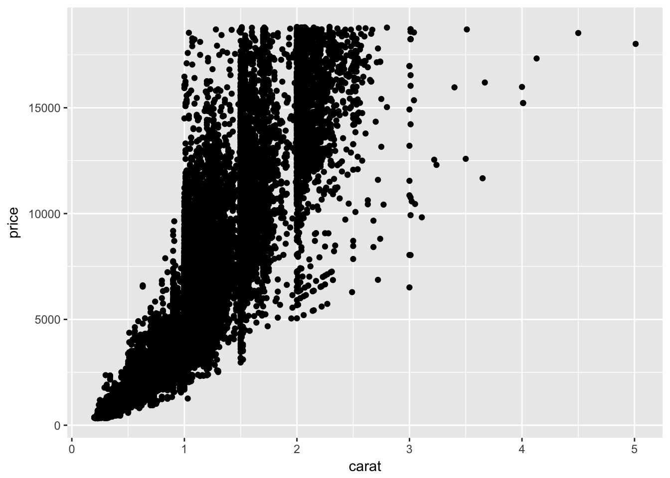
We could get this instead:
ggplot(data = diamonds,
       aes(x = carat, y = price)) +
  geom_point(color = "magenta")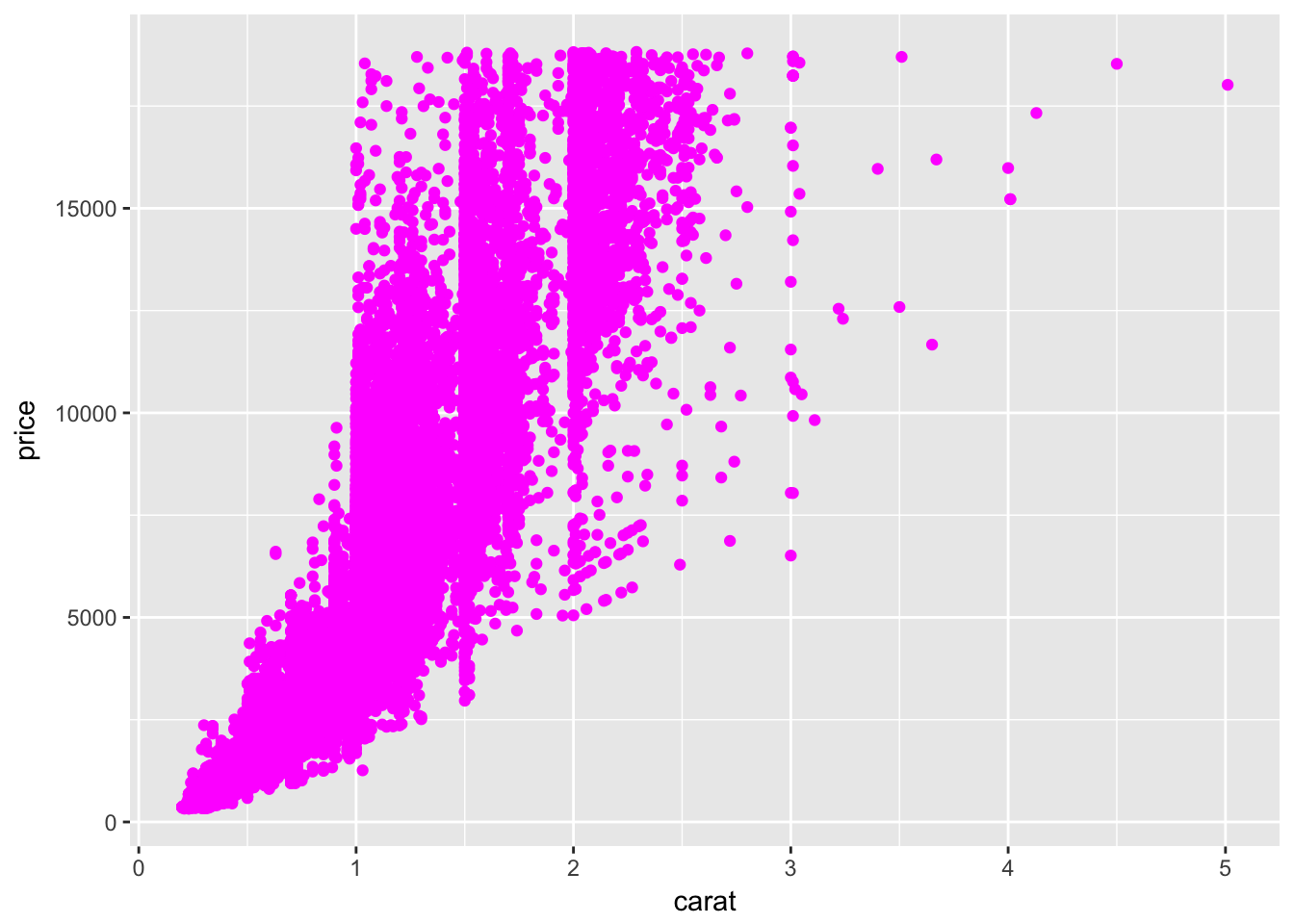
Our original plot
(with a small difference:)
ggplot(data = diamonds,
       aes(x = carat, y = price)) +
  geom_point(aes(color = clarity))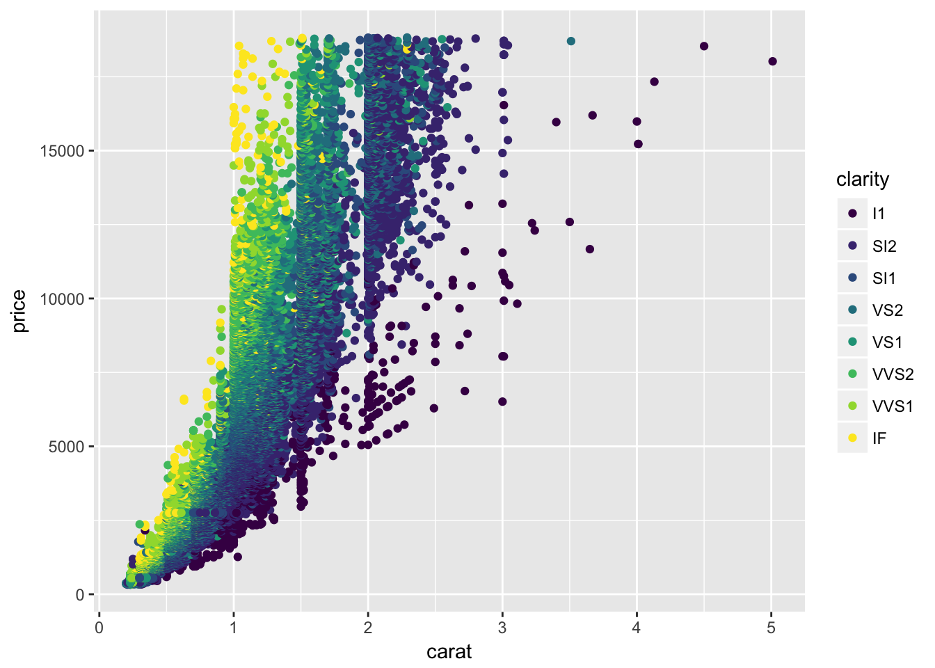
Add more geoms:
ggplot(data = diamonds,
       aes(x = carat, y = price)) +
  geom_point(aes(color = clarity)) +
  geom_smooth()
Change geom appearance:
ggplot(data = diamonds,
       aes(x = carat, y = price)) +
  geom_point(aes(color = clarity)) +
  geom_smooth(color = "black", size = 0.8, linetype = 2)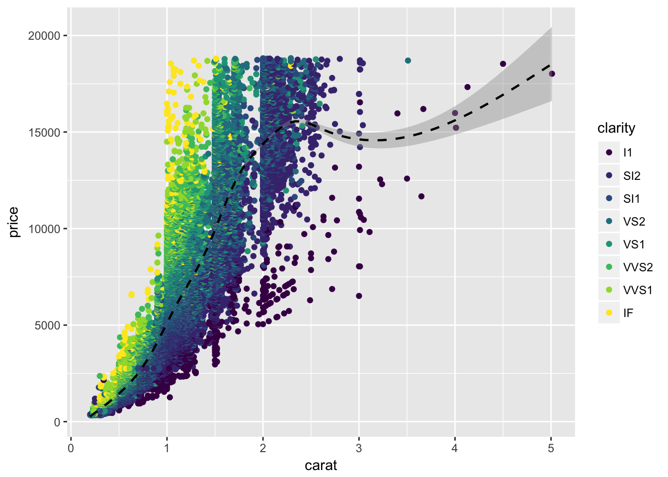
Make it look nicer:
ggplot(data = diamonds,
       aes(x = carat, y = price)) +
  geom_point(aes(color = clarity)) +
  geom_smooth(color = "black", size = 0.8, linetype = 2) +
  theme_few()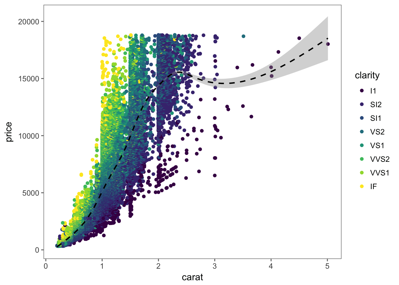
Try facets!
ggplot(data = diamonds,
       aes(x = carat, y = price)) +
  geom_point(aes(color = clarity)) +
  geom_smooth(color = "black", size = 0.8, linetype = 2) +
  facet_wrap(~cut)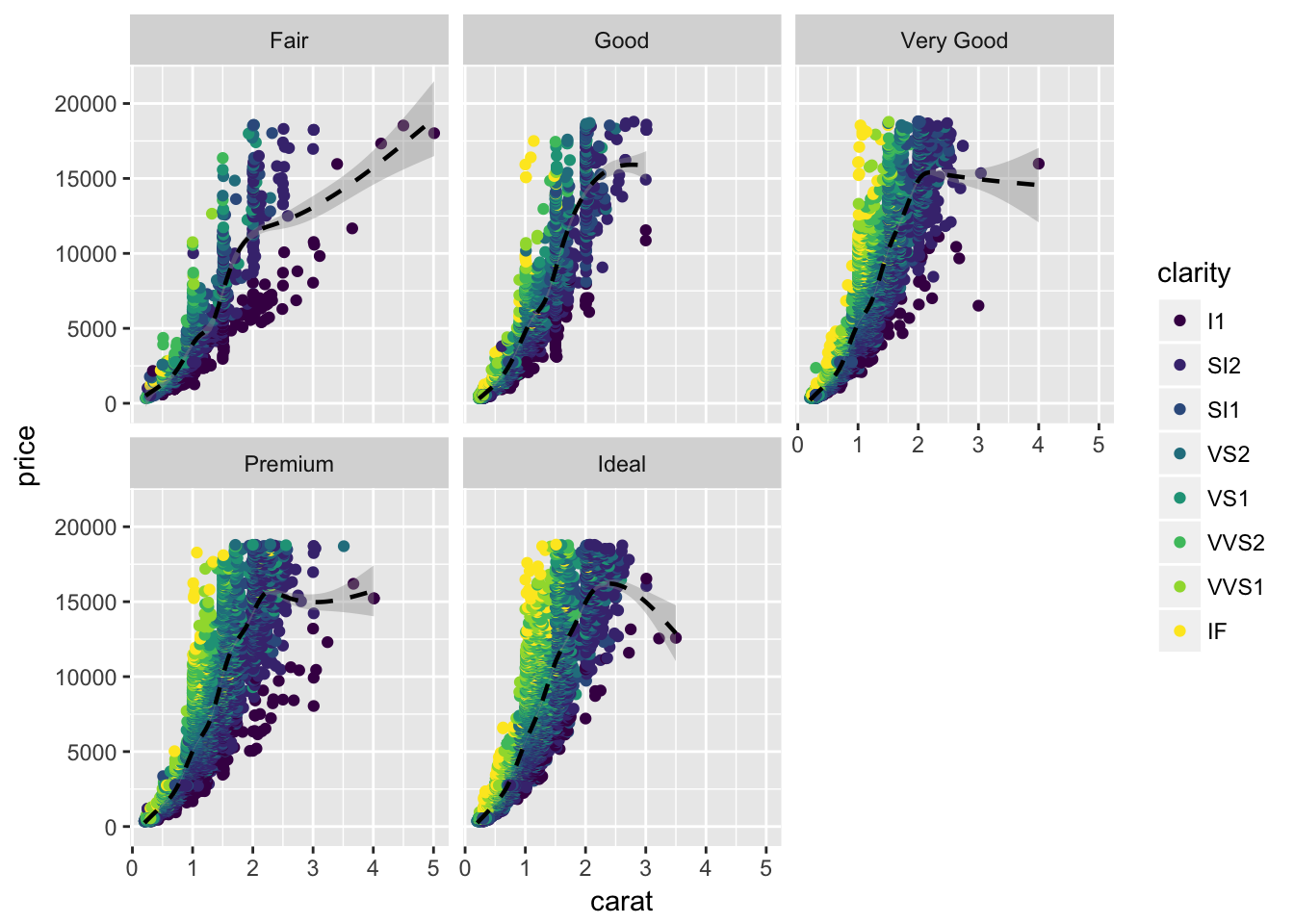
Two-dimensional facets:
ggplot(data = diamonds, aes(x = carat, y = price, color = clarity)) +
  geom_point(size = 0.5) +
  facet_grid(color~cut)
Try out color scales
ColorBrewer is useful and popular:
ggplot(data = diamonds, aes(x = carat, y = price)) +
  geom_point(aes(color = clarity)) +
  theme_few() +
  scale_color_brewer(type = "qual", palette = "Set2")
Different plot types?
ggplot(data = diamonds,
       aes(x = clarity, y = price)) +
geom_violin() 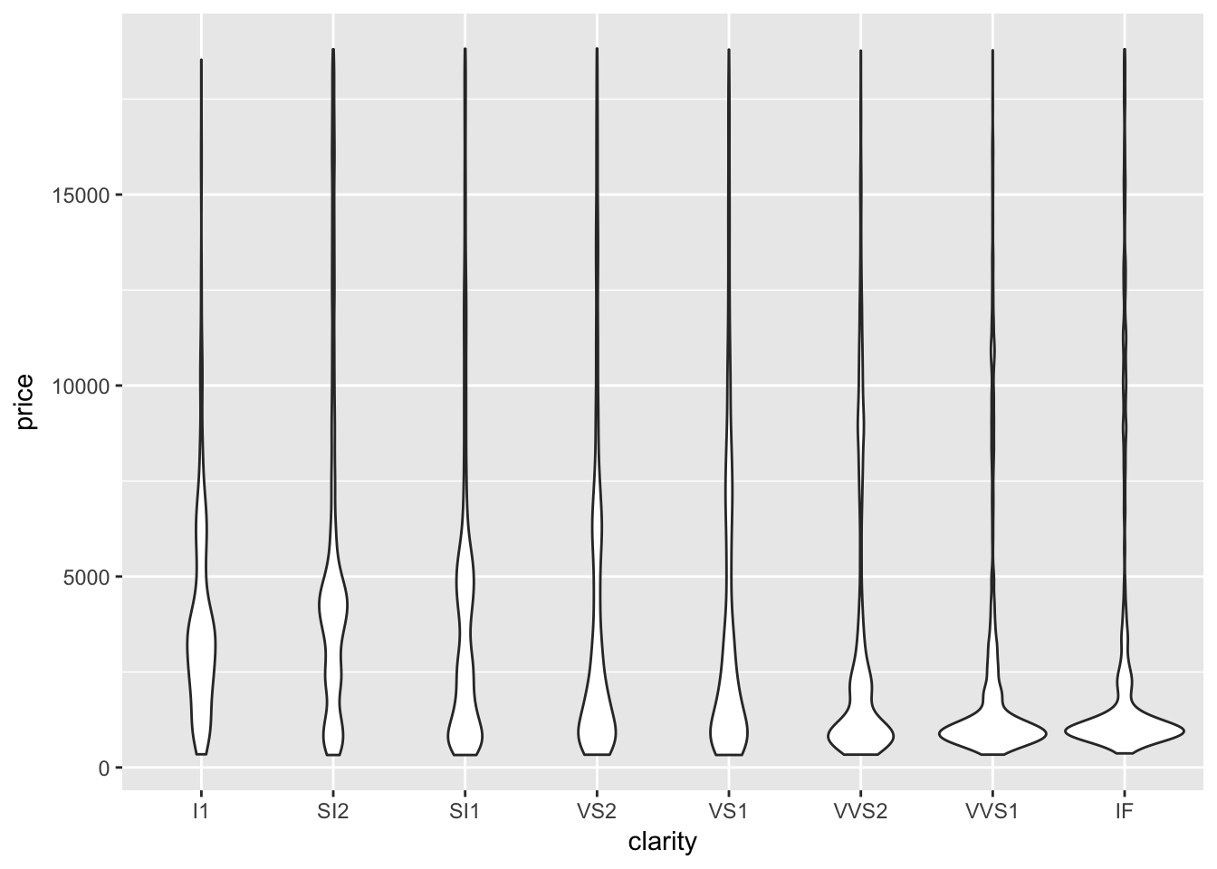
Try an extension:
ggplot(data = diamonds,
       aes(x = price, y = cut)) +
  geom_density_ridges()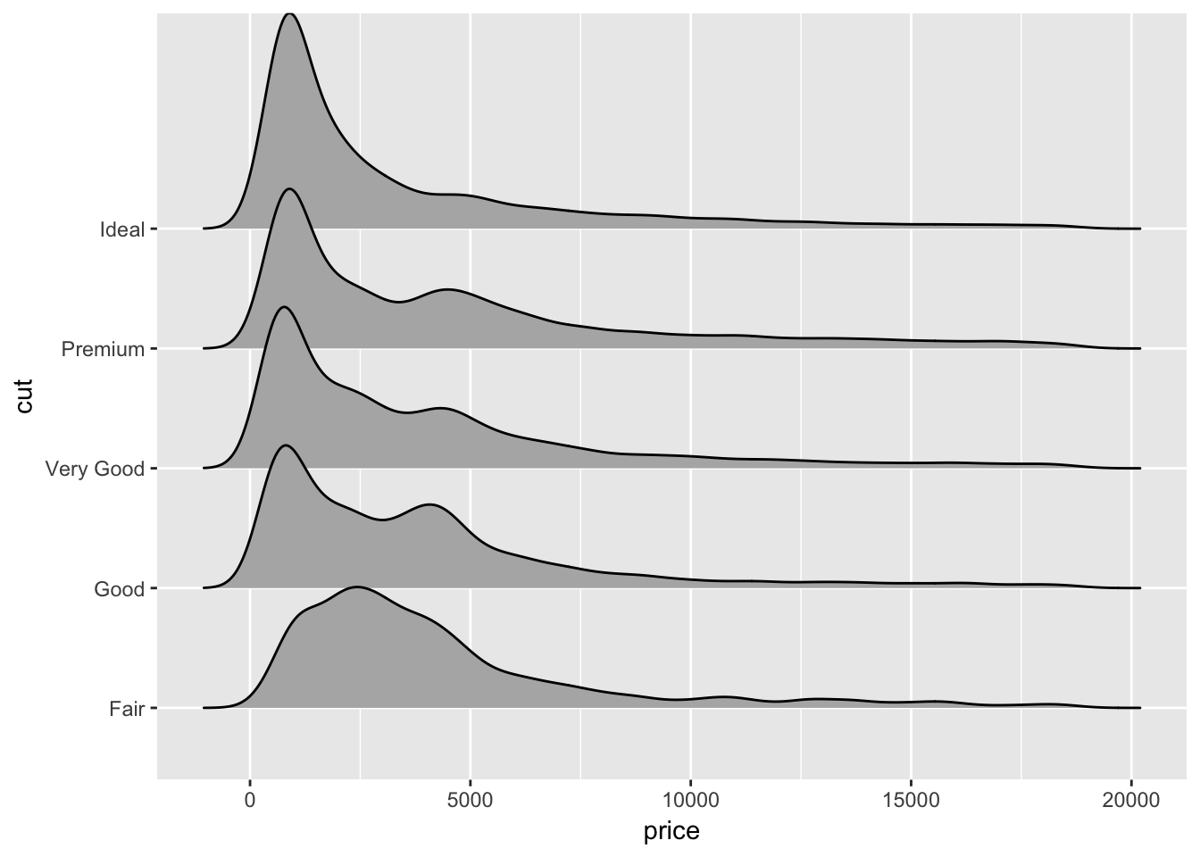
Choose colors: scale_color_…
ggplot(data = diamonds,
       aes(x = price, y = cut, color = cut, fill = cut)) +
  geom_density_ridges(alpha = 0.8, scale = 5) +
  scale_fill_viridis(option = "A", discrete = TRUE) +
  scale_color_viridis(option = "A", discrete = TRUE) +
  theme_few()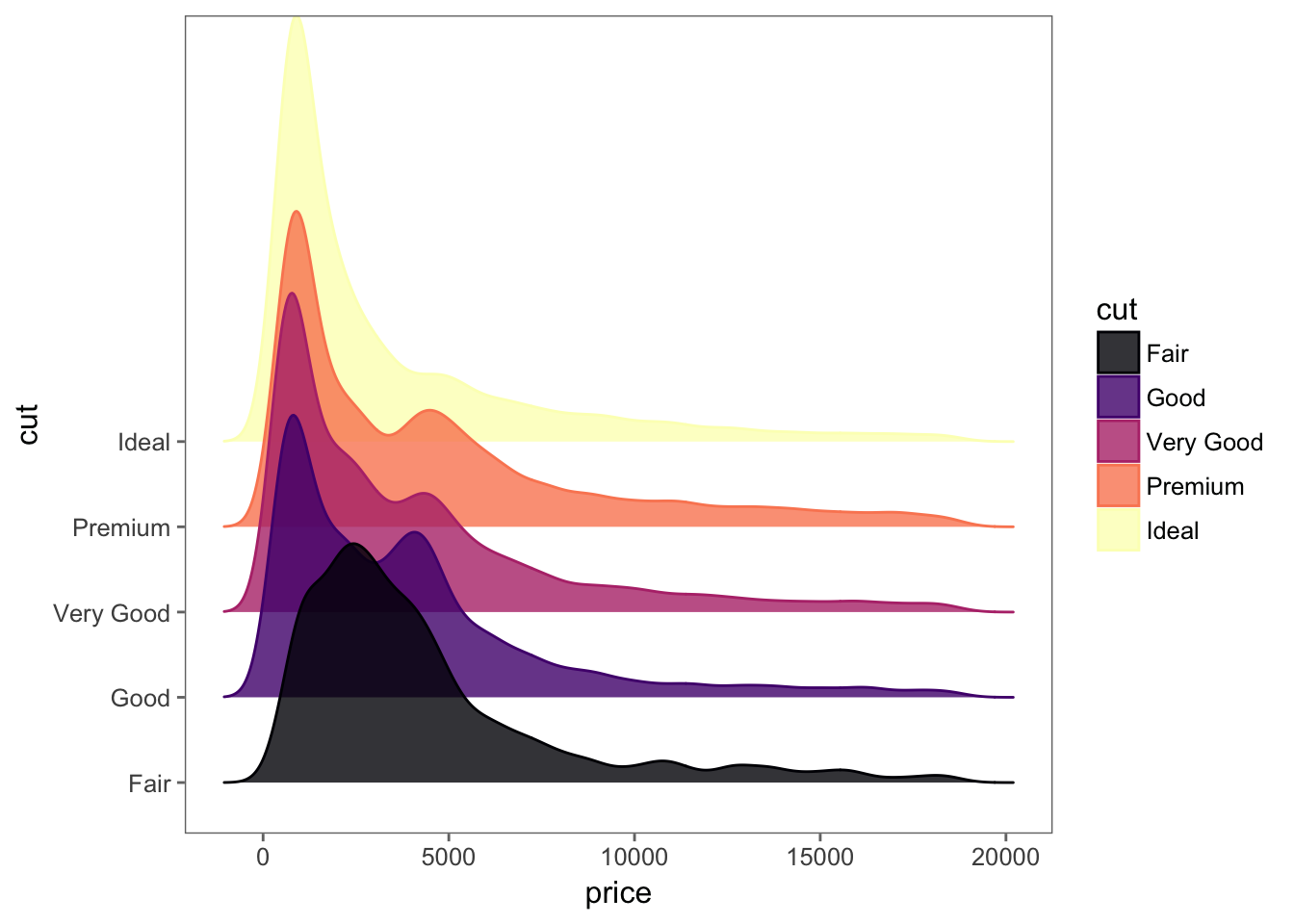
Another color scale:
ggplot(data = diamonds,
       aes(x = price, y = cut, fill = cut)) +
  geom_density_ridges(alpha = 1, scale = 5) +
  scale_fill_manual(values = wes_palette("Darjeeling")) +
  theme_few()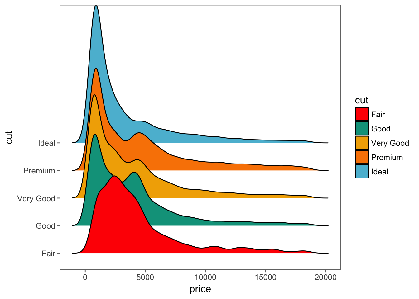
Sometimes we need to transform data.
kable(head(iris))| Sepal.Length | Sepal.Width | Petal.Length | Petal.Width | Species |
|---|---|---|---|---|
| 5.1 | 3.5 | 1.4 | 0.2 | setosa |
| 4.9 | 3.0 | 1.4 | 0.2 | setosa |
| 4.7 | 3.2 | 1.3 | 0.2 | setosa |
| 4.6 | 3.1 | 1.5 | 0.2 | setosa |
| 5.0 | 3.6 | 1.4 | 0.2 | setosa |
| 5.4 | 3.9 | 1.7 | 0.4 | setosa |
Wide or long?
iris_long <- melt(iris, id.vars = ("Species"))
kable(head(iris_long))| Species | variable | value |
|---|---|---|
| setosa | Sepal.Length | 5.1 |
| setosa | Sepal.Length | 4.9 |
| setosa | Sepal.Length | 4.7 |
| setosa | Sepal.Length | 4.6 |
| setosa | Sepal.Length | 5.0 |
| setosa | Sepal.Length | 5.4 |
Plot the data:
ggplot(iris_long, aes(x = Species, y = value, fill = variable)) +
  geom_bar(stat = 'identity', width = 1) +
  theme_bw()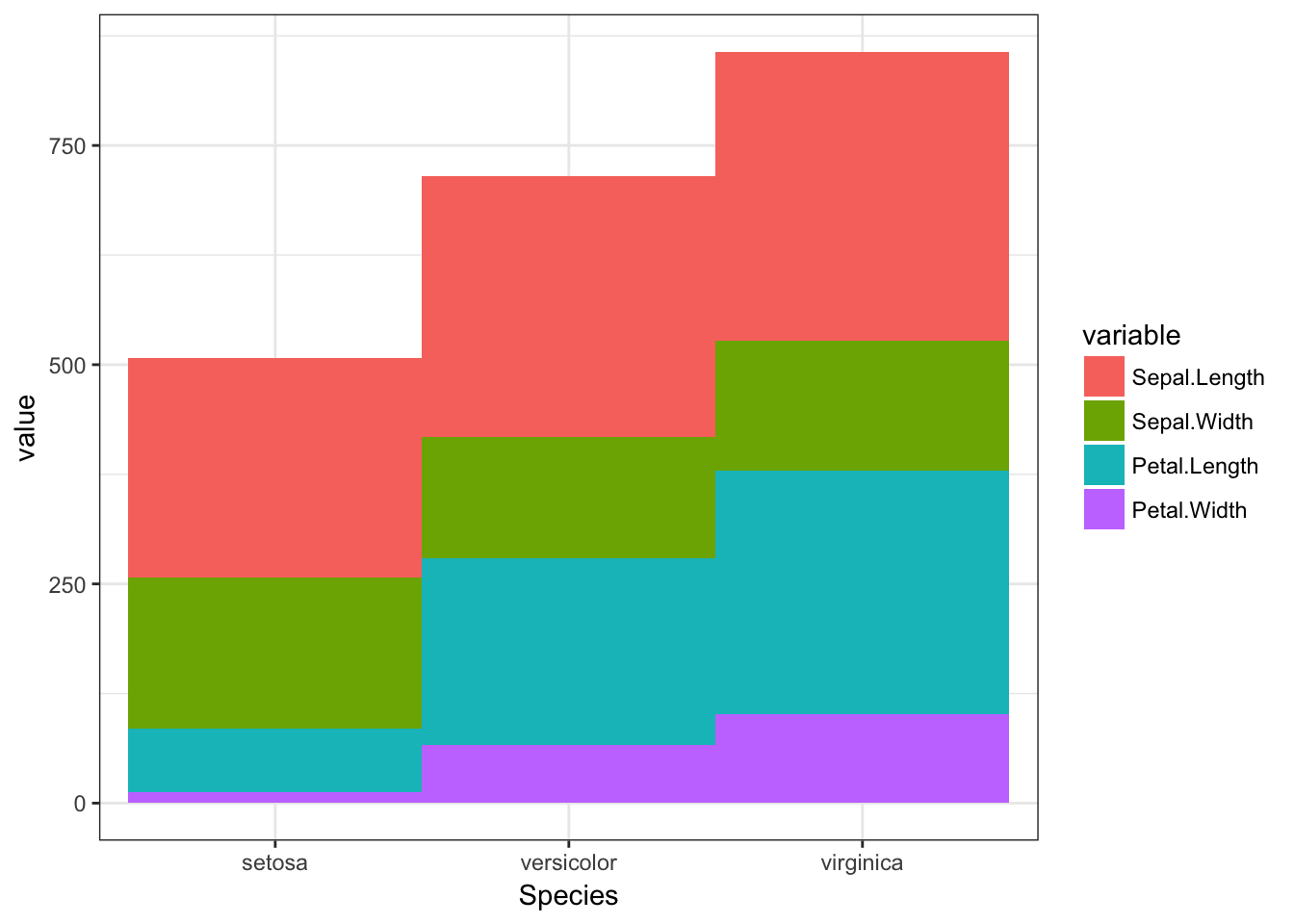
Change coordinates
ggplot(iris_long,
       aes(x = Species, y = value, color = variable, fill = variable)) +
  geom_bar(stat = 'identity', width = 1) +
  coord_polar(theta = 'x') +
  theme_bw()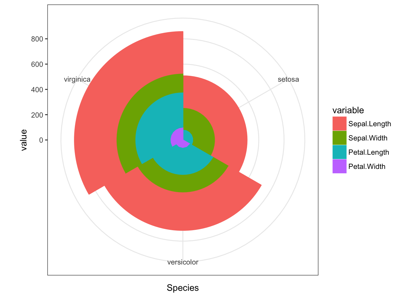
A more interesting dataset:
kable(head(gapminder))| country | continent | year | lifeExp | pop | gdpPercap |
|---|---|---|---|---|---|
| Afghanistan | Asia | 1952 | 28.801 | 8425333 | 779.4453 |
| Afghanistan | Asia | 1957 | 30.332 | 9240934 | 820.8530 |
| Afghanistan | Asia | 1962 | 31.997 | 10267083 | 853.1007 |
| Afghanistan | Asia | 1967 | 34.020 | 11537966 | 836.1971 |
| Afghanistan | Asia | 1972 | 36.088 | 13079460 | 739.9811 |
| Afghanistan | Asia | 1977 | 38.438 | 14880372 | 786.1134 |
A scatter plot:
ggplot(gapminder, aes(x = gdpPercap, y = lifeExp)) +
  geom_point()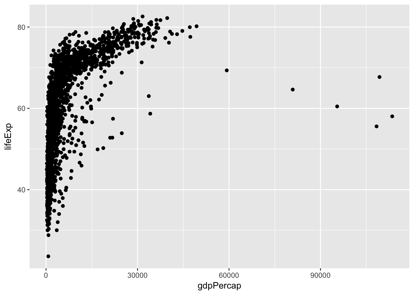
Who’s the outlier?
Who’s the outlier?
gapminder %>% filter(gdpPercap > 60000)## # A tibble: 5 x 6
## country continent year lifeExp pop gdpPercap
## <fctr> <fctr> <int> <dbl> <int> <dbl>
## 1 Kuwait Asia 1952 55.565 160000 108382.35
## 2 Kuwait Asia 1957 58.033 212846 113523.13
## 3 Kuwait Asia 1962 60.470 358266 95458.11
## 4 Kuwait Asia 1967 64.624 575003 80894.88
## 5 Kuwait Asia 1972 67.712 841934 109347.87Deal with overplotting:
ggplot(gapminder, aes(x = gdpPercap, y = lifeExp)) +
  geom_hex()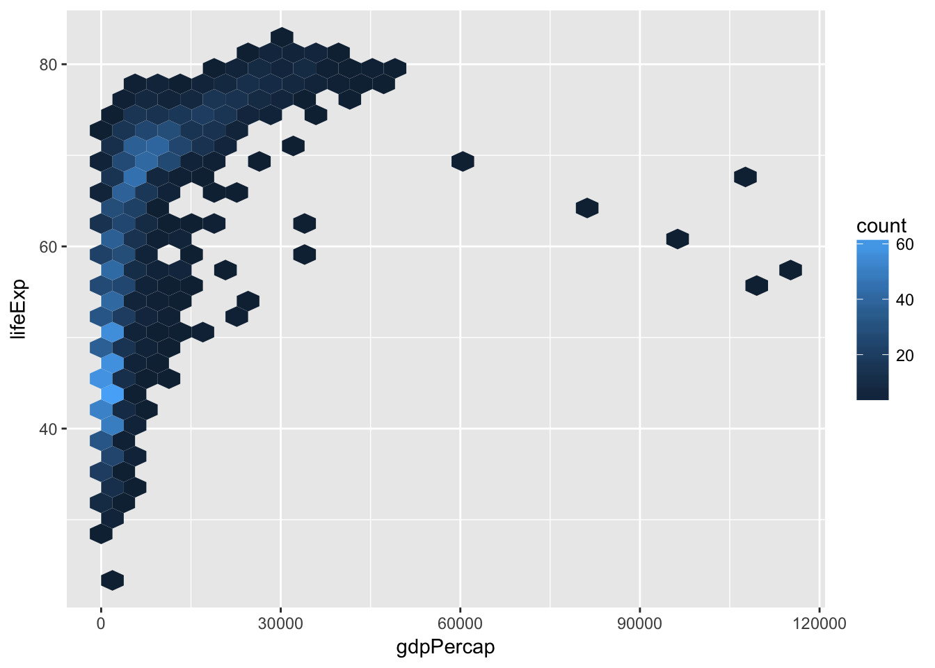
Another way to avoid overplotting:
ggplot(gapminder, aes(x = gdpPercap, y = lifeExp)) +
  geom_density2d(aes(color = ..level..), bins = 20) +
  scale_color_viridis()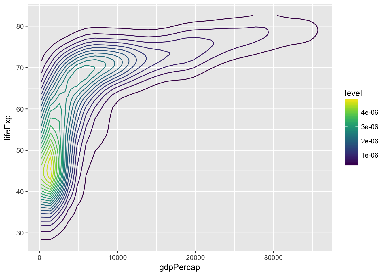
A little more complicated:
p <- ggplot(gapminder, aes(x = gdpPercap, y = lifeExp)) +
  geom_point(aes(color = continent, size = pop), alpha = 0.8) +
  scale_x_continuous(trans = 'log') +
  facet_wrap(~year) +
  scale_color_brewer(type = "Qual", palette = "Accent") +
  theme_hc(bgc = 'darkunica') +
  theme(text = element_text(size = 9))
A little more complicated:
p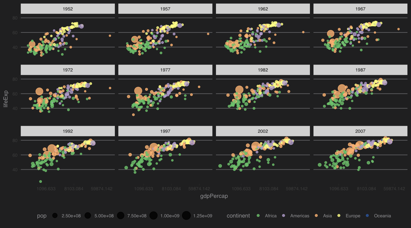
Let’s make a map!
Prepare data:
country_df <- map_data('world') %>%
  rename("country" = "region")
country_df$country[country_df$country == "USA"] <- "United States"

#Take the mean across all years for each country:
gapminder_means <- gapminder %>%
  group_by(country, continent) %>%
  summarise(lifeExp = mean(lifeExp),
            pop = mean(pop),
            gdpPercap = mean(gdpPercap))

plot_dat <- left_join(gapminder_means, country_df, by = "country")
Make the map:
ggplot(plot_dat) +
  geom_polygon(aes(x = long, y = lat, fill = lifeExp, group = group)) +
  scale_fill_viridis(option = "A") +
  coord_quickmap() +
  theme_few()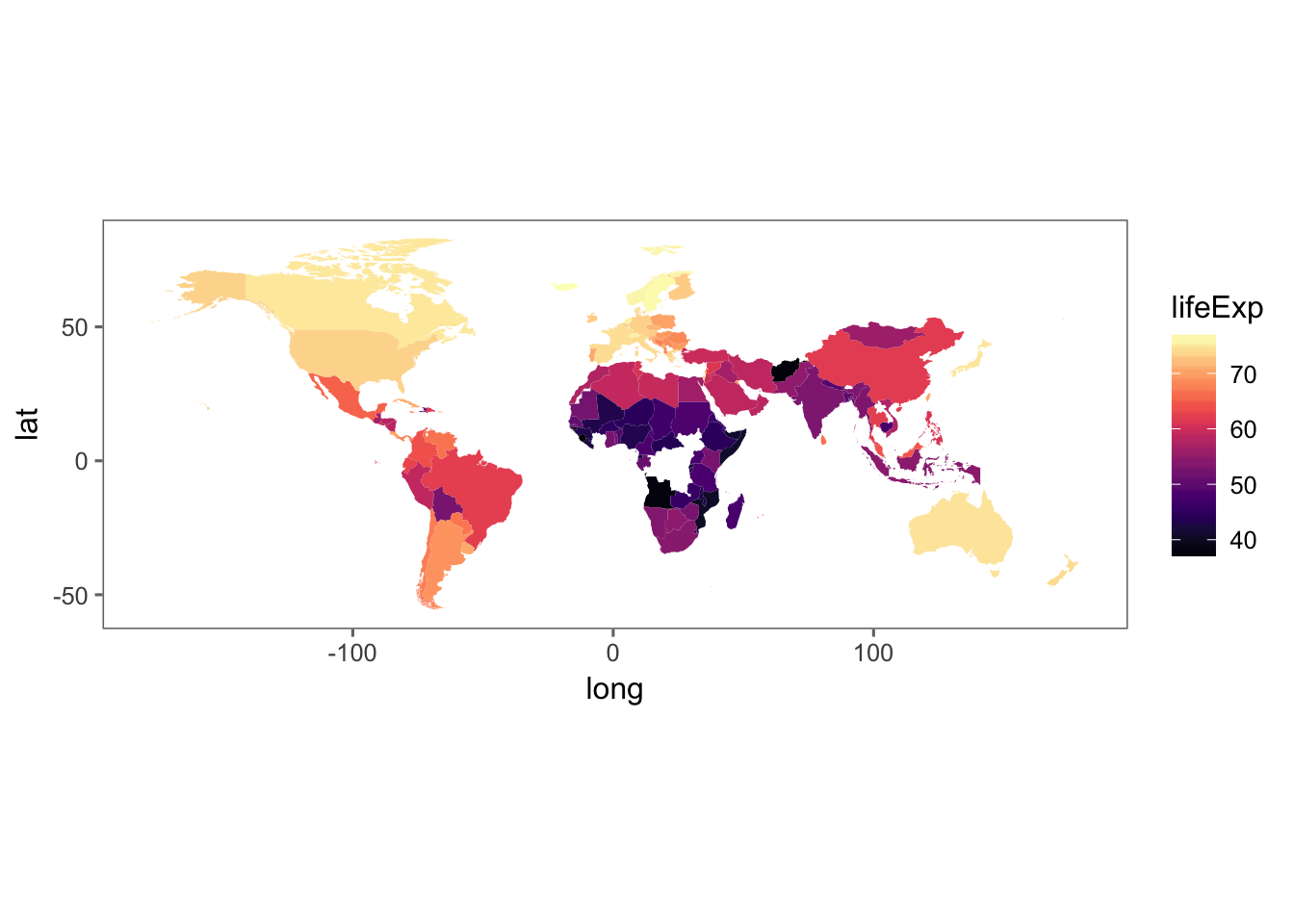
More plot ideas?
What questions could we ask with this data?
How could we visually answer those questions?
Where to learn more:
- Stack Overflow/Google
- Books:
- R for Data Science: http://r4ds.had.co.nz/program-intro.html
- Ggplot2: Elegant graphics for data analysis: https://www.amazon.com/ggplot2-Elegant-Graphics-Data-Analysis/dp/0387981403 (may also be available for free at github).
- Data visualization for social science: http://socviz.co/
Where to learn more:
- Papers:
- Wickham grammar of graphics: http://byrneslab.net/classes/biol607/readings/wickham_layered-grammar.pdf
- Wickham tidy data: https://www.jstatsoft.org/article/view/v059i10
- Tutorials, cheatsheets, websites:
Where to learn more:
- Twitter:
- @hadleywickham, @ClausWilke, @JennyBryan, @RLadiesGlobal, @rstudiotips
Questions?
Adrienne Marshall mars7850@vandals.uidaho.edu